TELEMUNDO
IDS
01
DESIGN CHALLENGE
In this project, my goal is to refresh the Telemundo logo with new animation techniques. The current logo for the Hispanic American television station has been in use since April 4, 2018. My objective is to create a Telemundo logo animation that feels fresh and relevant.
02
RESEARCH
Before working on the style frames, I researched the history of the BBC 2 animated logo. In earlier versions, the logo animations were more complex and narrative-driven, whereas newer versions are simpler yet visually appealing, with strong and clear concepts behind the visuals.
Telemundo aims to appeal to a broad audience within the Hispanic and Latino community. Therefore, I believe it’s essential to understand their culture. In my research, I found that music is a significant part of Hispanic and Latino culture, and bright, high-contrast colors are commonly used in their art.

BBC 2 Logo Animation 1997


BBC 2 Logo Animation 2021
Bright, high-contrast colors

Music in Hispanic and Latino culture
03
APPROACH & IDEAS
DIRECTION 01
"Hola Amigo"

My first idea is to use friendly greetings in Spanish to engage a diverse Hispanic and Latino audience. This approach emphasizes bright, contrasting colors and varied fonts to reflect the audience’s rich cultural backgrounds.
04
DIRECTION 02
"The Nation of Music"

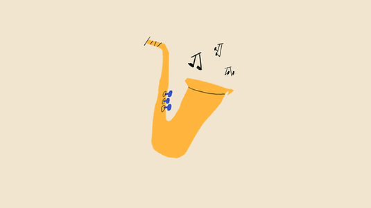
My second idea focuses on the cultural background of the audience. Hispanic and Latino communities have a rich musical heritage, so I want to incorporate traditional instruments, such as the saxophone and piano, into my design. This will help the audience feel more connected.
DIRECTION 02
"Stick to the original"

My third idea focuses more on the logo itself. Inspired by the BBC 2 logo animations, this approach places a simple logo over an animated background, with a 3D logo revealed subtly within the animation.
STYLE FRAMES DEVELOPMENT
After discussing with the art director, I realized my style frame needed some adjustments. First, the overall composition felt a bit too compact, so I moved some letters to the sides to create more space in the center. Additionally, I repositioned the logo from the bottom to the center of the frame, as it needed to be the focal point.

Version 1

For the third idea, we agreed that the logo should not stand alone, as it would appear monotonous and fail to convey the underlying concept. Instead, I split the logo into two parts and rearranged them into a flower shape, symbolizing the diverse cultural backgrounds of the audience. This approach aligns with Telemundo’s overall concept.
Version 1

Version 2

Version 2
Eventually the second idea was selected and moved into the animation stage.


05
ANIMATIONS
1st pass animation
For my first animation pass, several adjustments need to be made. First, the animation should be divided into two parts: the first 3 seconds should showcase each instrument, and the last 2 seconds should reveal the logo. Additionally, remove the trim path animation on the logo. Finally, change the background color from white to a warmer tone.

Revision pass animation
To improve the music for the animation, I spoke with Kelly to find a better track. In the third pass, I animated all the instruments and music notes in a more dynamic and engaging way.

2nd pass animation
For my second animation pass, the most important adjustment is that the entire animation should sync with the music. Additionally, each instrument in the first 3 seconds should have its own distinct sound. The movement of the music notes should also be more dynamic and engaging.

Final pass animation
For the final animation pass, I added more movement to the bottom of the saxophone and also to the piano keys at the end.

06
TECHNICAL EXECUTION


To create the effect of the strings playing, I applied path animation to each string, allowing me to add keyframes individually for each one.
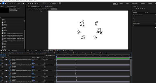
The only thing to note about the music notes animation is that I pre-composed them, allowing me to easily apply them to different sections of the animation.
In the final scene, I added camera animation to enhance the drama. I introduced a new camera and parented all layers to it, creating a receding effect.
07
FINAL RESULTS


In summary, this project was simple yet engaging and provided a great opportunity to focus on logo animation. Combining music with animation also proved to be an exciting theme.